Yearly Archive: 2013

Iron Man 3 – the official game (Casanova armor)

20131231-111418.jpg

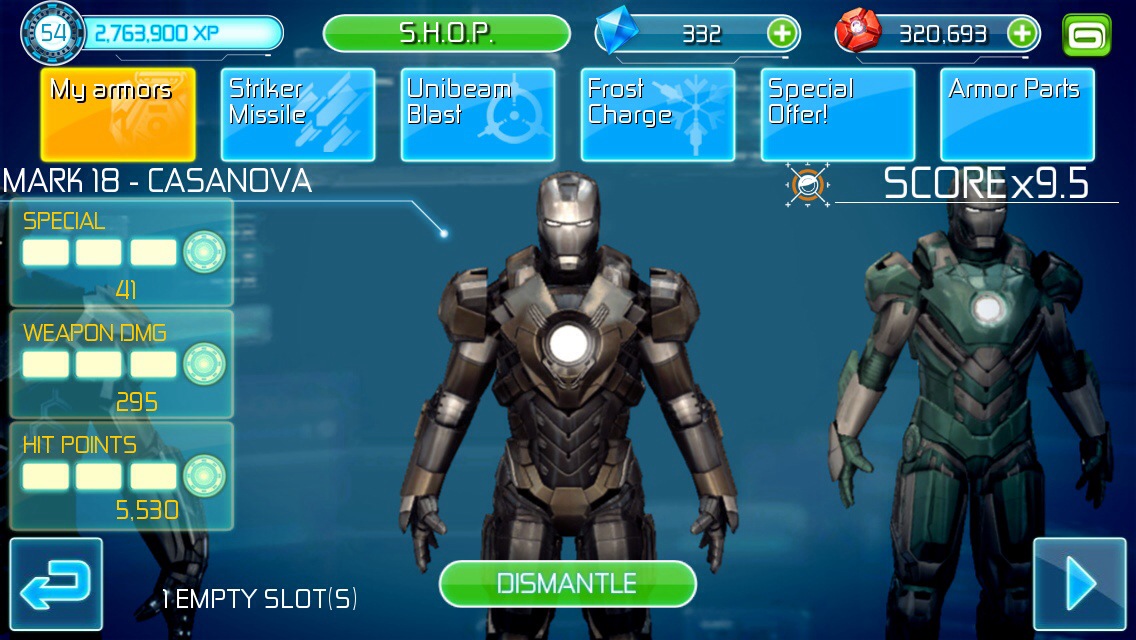
So I’m having an Iron Man 3 game addiction currently apparently. I’ve been playing a lot since the new update. Really wanted to see and try out the new anti missile special. Although the new Nightclub and Disco armor do seem weak. Low multiplier, health, weapon power etc.
Collecting the pieces is very long and troublesome. Pieces don’t spawn that much and only in the dessert and space location.
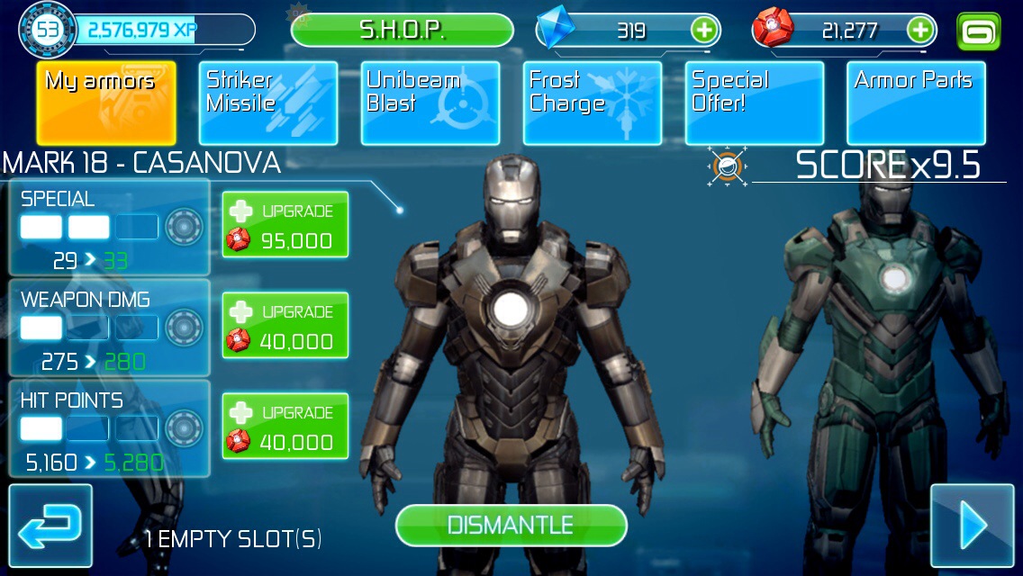
So really glad that another one was available last week. The Casanova armor, unlocked it (got enough experience). But not enough Stark Credits (415k needed). So after a week of playing and collecting…
First impression: missile special seems ok. Guess need to upgrade to a longer duration. The one downside of the new weapon is that it takes forever to charge…which…makes it less useful then expected.
The other stupid thing is that the weapon skill can only be activated when there are planes or missiles present…which sometimes activates to late and you get hit…sigh…defeats it purpose if you ask me.
Going to upgrade it to the max and see how it does compared to the Piston armor. That is still the best one. 10 seconds invulnerability on a max out special. My choice and go to to avoid the difficult missile clusters.

*Update*
It took a while but finally managed to upgrade the Casanova armor to the max. You got to do 380 times a 10 hit combo for the special weapon, defeat 2400 AIM soldiers for regular weapon & avoid 9000 obstacles for health. But max out armor is sweet. 41 seconds worry free travel against missiles is fine 🙂

20140108-171024.jpg

Creativity… or more the lack of it…

20131121-143236.jpg
Sigh somehow currently stuck at an app creation progress. I have the framework and global functioning done. Now I only need to get a certain thing right…but I can’t seem to get there for the last couple of days. Sigh…I can’t get the sentences right. I know what I have to say…. but I don’t know how to say it.
Do you know the feeling? I know what I need to do, but somehow I can’t seem to get it done. Like being in school again. I know that I have to do a certain report. Due date is coming…but when ever I get behind the computer…just blank. I can’t seem to put a sentence on the screen. Not even a single word.
What to do? What can you do? Me. I’m the person who then tends to start digging into myself. Which only leads to more questions and even more trouble. Sigh. Best thing then is to take a break, and have a kitkat. Like that line. Catchy and easy to remember. But anyhow, take a break. In this case step away from the computer. And do something else. Some say shift your focus on to something else. But isn’t this putting things off and how to say it? Avoiding work? But what can you do? Inspiration isn’t something that you can force…or is it? What you can do is minimize the distraction.
Mind is something weird. Sometimes thinking about something else and also doing something else, helps. You get something done. Give you a good feeling. And with that extra good feeling, you go back to that
big…
dark…
heavy…
something…

Fixed AppStore Search Result

Today I discovered something disturbing about the AppStore search result. I used to get a listing of all my apps when I search for my developer entry name “mysteryfiles.nl”. So like always I type in the name and this time…my apps aren’t in the first search results. Look I’m a small time developer and don’t have tons of app downloads and ratings. I don’t do false advertisement, fake reviews, paid downloads or all the other stuff. And seeing someone else getting called first for the results of your own freaking name disturbs me…

20131114-123310.jpg

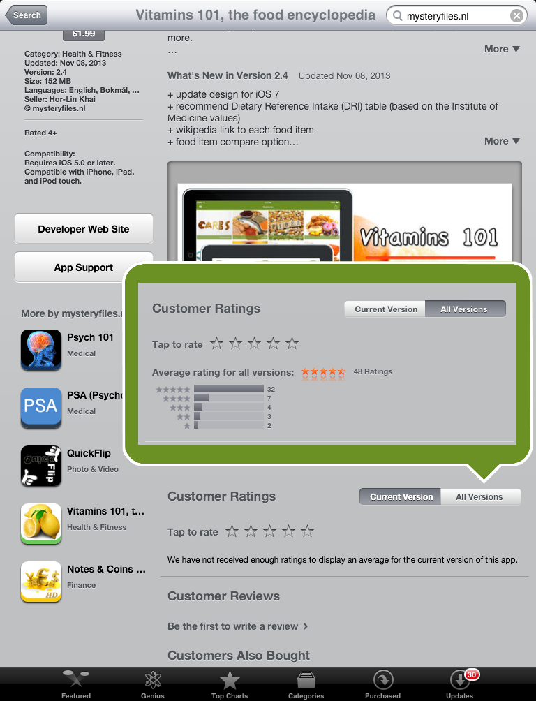
On the iPad Results my apps are only showed on the second page of the results. On the iPhone Results my first app is Vitamins 101 in position 5. So Apple did something with their search ranking system. You can clearly see this with the first four apps in the iPhone Results, they have hundreds of ratings and mine have none. Does this mean that Vitamins 101 has no downloads & ratings? When I tap on it, the ratings sections shows nothing. But when I press the previous version, then I see my precious 48 ratings.

rating_field
I don’t like the ratings system, with current app version having more influence on search results. As a small time developers it means whenever you update your apps: you lose your app ratings and have to hope, wish & pray that your app will be rated by someone. App visibility & ranking depends on app ratings nowadays.

Anyways I still can’t dismiss the uncomfortable feeling from searching for my own developer name and not seeing your own apps show up as the first results. This is wrong right? It smells fishy…

App update: Vitamins 101 (2.4)

20131108-110623.jpg

Like everything: it all starts with an idea. In this case an update for Vitamins 101. An idea for adding new features to it, like what about a compare option? Ok, I can do that.
What about some wiki info? Ok I can do that.
What about a DRI table? Ok, I can do that.
What about a conversion table? Ok, I can do…no wait a moment… I already did that.

Next question: where to put all this? A slide in table with buttons for all those option? A toolbar at the bottom? One button in the navigation bar that calls up a popover menu? A menu that comes up with a gesture?
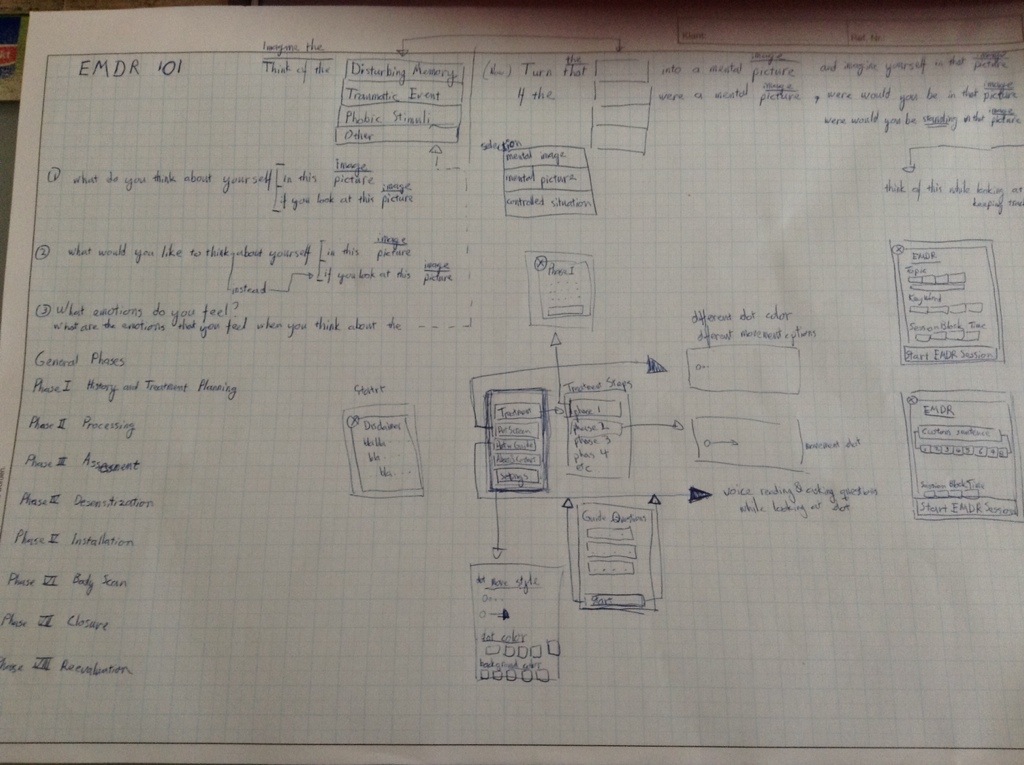
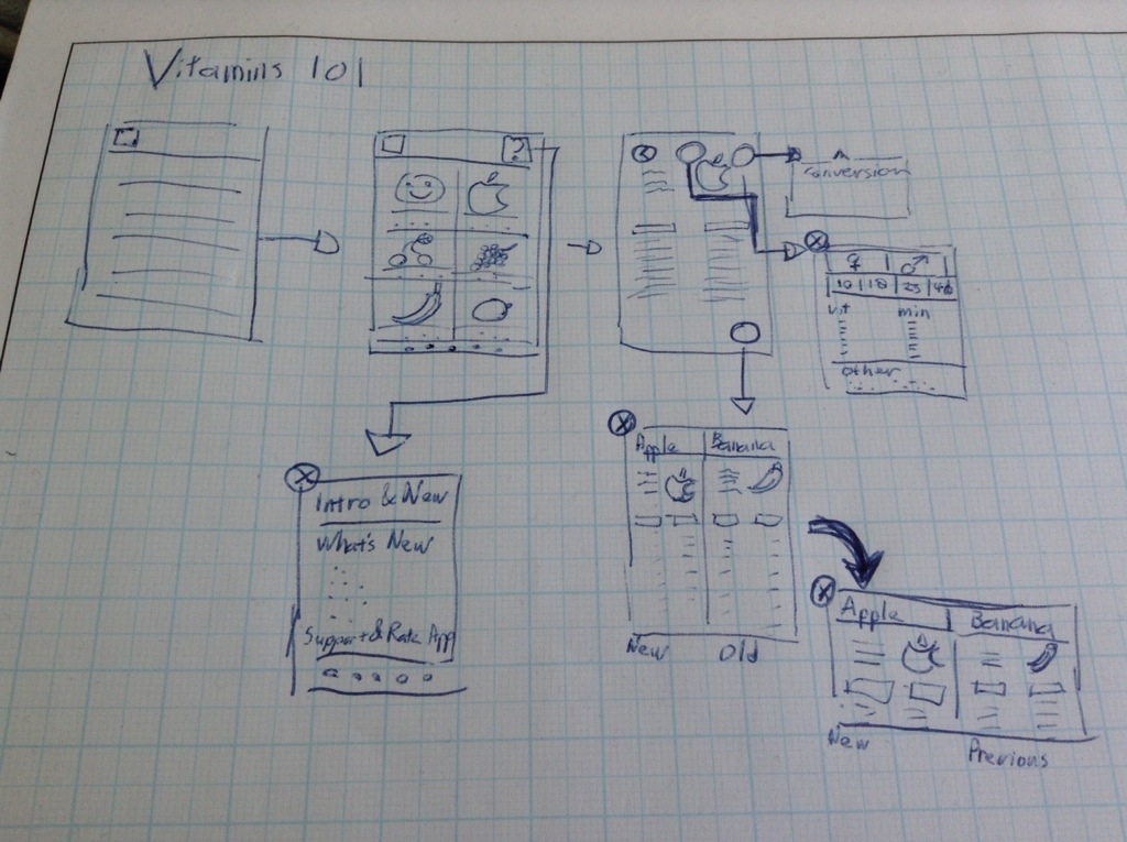
Those are all possibilities. I guess it all depends on the taste and personal preferences. But I chose the separate button options…or more I started drawing a general layout of what I got from my previous update. Start at what you have. And from there I started to add the things I want. Draw a button there…and add an arrow. An new interface (which is just another square drawing). Put in some scribbles. No need for fancy things. Because it’s just me. I don’t have an independent developer who needs to read my scribbles & decipher the things I want. But sometimes I do need to switch between thought processes. Design issues in layout. I want it t look like this. But then the programmer in me thinks no… I can’t do that, it will lead to a crash. Or the Apple Human Interface Guidelines will reject that straight away. Yeah there is something like that. Anyways, where was I?

The creative process starts with an idea. And from there…it all depends on the person. I for one have to put it on paper first and visualize it in my mind. When I have the general picture. Then the coding starts. Sometimes fast and easy to execute. And sometimes painful with lots of crashes & error messages. Sigh…back to looking up through code examples and libraries. And the painful feeling man I don’t know anything. I don’t understand it. Why can’t I do it in one try? So needless to say lots of negative feelings. And some inner screaming. Arghh….

But why do you keep or choose this line of work? Ehm…don’t know. But one thing is for sure when I do find the answer I’ll let you know.
Live is full with ups and downs. Negative feelings…and positive feelings. All I can hope that it balances out in the end.
Anyways enough of my random thoughts. The update for Vitamins 101 is done. It’s at version 2.4 now. Let me know what you think….


The digital result:

Guide1_Vitamins

Different iOS Icon Sizes

A quick reference post about iOS Icon Sizes.

iOS 6 and lower

iPhone 3GS and lower (Non Retina Display)

Icon-57.png

Amy-57


iPhone 4 and higher (Retina Display)

Icon-114.png

Amy-114


iPad and iPad mini (Non Retina Display)

Icon-72.png

Amy-72


iPad (Retina Display)

Icon-144.png

Amy-144


iOS 7 and up

iPhone 4 and up

Icon-120.png

Amy-120


iPad and iPad mini (Non Retina Display)

Icon-76.png

Amy-76


iPad (Retina Display)

Icon-152.png

Amy-152

A tribute to…

20131005-085027.jpg

I’d been two years now…

Although he’s gone. His influences still remains.
So I invited all of you to think about him, whenever you sit behind your computer or look at your phone.

If you don’t know who I’m referring to, never mind business as usual.
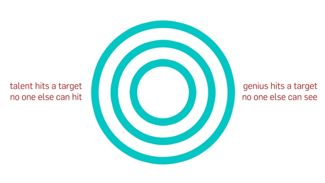
A genius doesn’t stop and reflect on things, they move on. Work when everyone is resting or asleep. All in the name of creating the next big thing!

PSA (Psychological Symptoms Analyzer)

Icon-152Just released a new app called PSA,  short for Psychological Symptoms Analyzer.

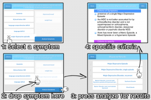
PSA is an application that helps you diagnose a mental disorder in a new way.

You simply have to select the symptoms that are present by dragging them to the selection field.
When you’re done start the Analyzer process.
This will give you some possible mental disorder diagnoses. Tap on them to see the specific criteria requirements for a proper diagnose (based on ICD, DSM). As a quick reference usage of the app, you can tap the library button and search for a mental disorder directly. Tap on the mental disorder to see the specific criteria requirements. Or read more about the disorder by pressing the wiki button.
PSA_phone_promo2
________________________________________________________________
Developers Blabla

I wanted to call it a psychological symptom analyzer tool first and shorten it to PSAT, but that a name conflict with the PSAT test. Or the better-known version of the SAT test. Name confusion is one thing but the other thing is maybe taken down notices due to intellectual property rights or something of that matter.

So PSA it is then.

I designed it in the hope that it would make the diagnose process easier by using symptoms tag as the first filter. And after that the specific mental disorder Criteria (set by DSM and ICD) check for a proper diagnose. Or just go straight to the Criteria check by searching for the mental disorder.

BTW I’ve also included the quick Criteria search data into Psych 101, really like how that data function turned out. So why not, it makes the app better.

Now I hope the user will also think this way and rate the app. With the current AppStore ranking system, highly rated apps are treated better. Which equals more downloads. And those downloads translate into certain paper and metal stuff that I can exchange for food & shelter.

download on the app store

new iPhone 5C

iPhone5c_vs_iPodTouch5

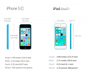
When I look at the iPhone 5C, I can’t stop thinking that it looks a lot like the iPod Touch 5.

In design not much difference than the iPhone 5C being thicker, a mute switch on the side, a speaker on the top below the iSight camera in the front, a black front glass, no strap thingie button at the back and a single part hard-coated polycarbonate back.

So underwhelming or not when you look at product design in general?
On the other hand looking forward to the iPhone 5S! Fingerprint recognition with TouchID, 64 bit processor, motion processor and lots of camera fun.

But back to design and colors. I do like the overall package of the iPhone 5C in combination with iOS 7. The first step of hardware & software combined, all pointing back to Jonathan Ive.

Fine…. Bang!

Mindy: A handgun bullet travels at more than 700 mph.

Dave: Hey … Absolutely not. No!

Mindy: Look, if you don’t want to do it. You don’t have to do it.

Dave: Good. Okay. I don’t want to do it.

Mindy: Fine… Bang!

chloë grace moretz


(Opening lines in Kick-Ass 2 the Movie)