Author Archive: Link

A dreadful blue envelope…

So every year around April you have to do taxes, here in the Netherlands. And then a couple of months later (most of the time in June) you get a letter with the result. That’s pay extra taxes or you get money back. Getting money back is nice… but that’s not always the case of course.

This year I got a blue envelope (that the signature sign of the tax envelope here), a little earlier then usual. So I opened it and… yeah I have to pay pre taxes for 2015. But I haven’t submitted my taxes yet for this year. Sigh… who is in money trouble? Me or the government? With I big sigh I wired the money. Note it’s January the 9th.

And then next to this letter, there was another letter inside the envelope asking me if a wanted to fill in an automatic access permission to my bank account for the IRS. With that they (the IRS) can withdraw money from my account. In the letter they literally say to make things easier for both of us. The example they gave was: say if I don’t pay in time you have to pay extra late fees. So with automatic access you’ll avoid those fees. Ehm I don’t know if there are people who would accept this reason and fill in the form. But for me that’s kind of a hard line to cross. No thanks I don’t want to give access to my account. I did rather get the letter and see what I have to pay. And beside most of the time when people don’t pay in time is because of one simple reason: they don’t have the money. Or are clumsy and absent minded to forget about paying the bills.

Seriously only in the Netherlands: give us access to your bank account. No way! This is just a big, big NO for me. Look it’s not that I don’t trust the government / IRS / or what ever, but giving access to automatic payment withdrawal should only be for services provided. Like a subscription to the newspaper, phone bills or rent even. But automatic payment withdrawal for the government… what kind of a service do I get from them? Beside more bills to pay?

IMG_0585.JPG

Something new :)

IMG_0002.JPG

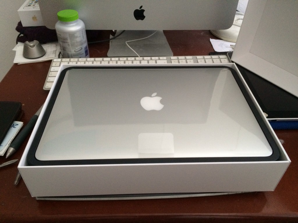
So I bought something new today. What could it be…

A new MacBook Pro 13 Retina. I still ask myself the question: Why? Do you need it? It’s a big purchase and to be honest money is tight. But then my iMac (current main working station is running slower by the day) is having trouble running X-code. And with the new iPhone 6 plus screen size….certainly not an optimum viewing experience when I try to code something using story board. So that my cognitive resonance talking and convincing me to buy a new MacBook Pro.

Any how my first impression is wow…. love the Retina display. Old iMac is 21 inch from 2000. So certainly a big improvement. Currently typing this blog on the MacBook and the keyboard is also nice. Backlight on the keyboard…is again… impressed. I wonder where the light sensor is. Will it be on all the time or is there a time out thing? Have to look into that.

So next to this also an update and a new years resolution: that’s to write more in this blog. But the question is how often? Every day seems a bit to much to be honest. And knowing me….not achievable. And also don’t want to spam the blog post with content about who knows what. In the end I decided to do a weekly post. This is doable. One post a week. 4 post a month. 52 post a year. The next thing…is set a day? No that’s setting a deadline and more pressure (or something like it). A random day in the week then.

What now? What to write now? I’ve worked and a small sleep widget app using the HealthKit. Submitted it last week. So I should hear something from Apple this week. Wether it’s approved or not. I had to do a privacy thing and I don’t know if I did it right or not. The main thing about the app was recording the sleep time and writing it into Healthkit. The app itself doesn’t store any data. So a simple privacy policy in one sentence. I wonder if it would be accepted.

The new HealthKit api is kinda amazing. Certainly lots of new and interesting things that you can do with it. One idea is that I would integrate Vitamin 101 with it. So somewhere in the future I’ll be adding a small data entry tool that enable the user to add all the vitamins and mineral info of their food item consumption to it. With the last Vitamin 101 I kinda reworked the whole food data base under the hood. So it should be doable.

That’s all I guess for now. Writing my thoughts down. It’s kinda weird. I do have a dairy app (Day One). But that’s more personal stuff and more free flowing thoughts. Writing a blog is different.

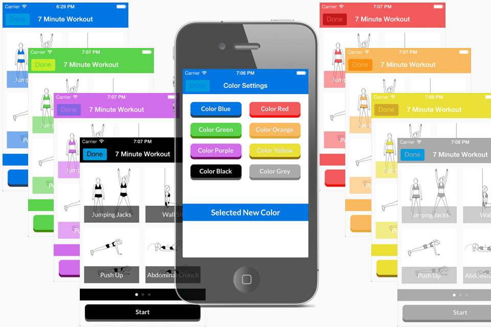
TweetPaper App

IconBig5TweetPaper is finally live after month of hard work. What is

What is TweetPaper?
TweetPaper is a Twitter Client.

So? There are a lot of Twitter Clients in the AppStore.
Indeed, you are right.

What’s so special about it?
It depends on what you consider special. It can’t turn water into wine or iron into gold. But what it can do is display your Twitter feeds in a new way.

In a new way?
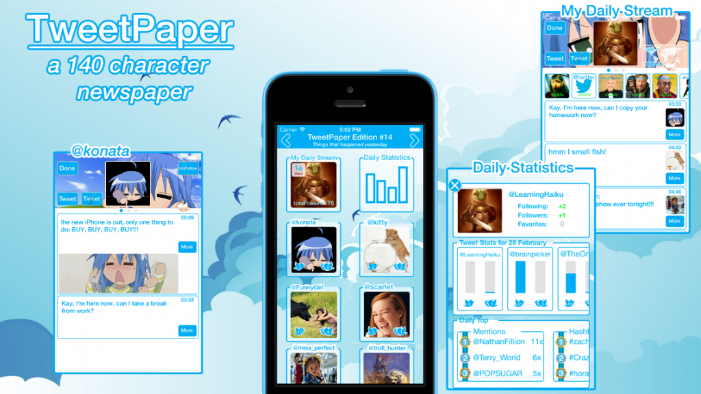
Yes, TweetPaper organizes your tweets into 3 separate view-frames (today, yesterday and days ago).

Ehm… view-frame?
Yeah, weird name. Open for suggestions. But the point is that a view-frame only contains tweets for the day of interest.

Day of interest?
“Today” is for the current tweets and “yesterday” for all the tweets from yesterday.
“Days ago” is a special one, which allows you to select a day and all the tweets of the selected day will be shown to you. It acts like an archive function.

Hmmm….what else can you tell me about view-frames?
A view-frame collects all the tweets of a day and analyzes the tweets specifics, like hashtags, mentions and retweets. All this info is gathered in the “Daily Statistics” frame that you can select.

Another frame?
Not quite, it more a part of the view-frame itself. Because each view-frame has one.

So it’s more a sub-frame or sub-view.
Yes, that’s the right programming term. But going back to the “Daily Statistics” frame, here you can find all kinds of tweet statistics. Like how many tweets or retweets was send by you or the persons that you follow. And when you click on them you’ll see a graphic display of that info.
“Daily Statistics” also contains a daily top section. Daily top lists the top 3 in tweets, retweets, mentions and hashtags.

Hah…now I understand the name statistics.
Yes, but an easy and understandable one, with…

What ever! What else?
Daily Statistics also tracks your following and followers count.

Ahh…you’ve got my interest. Tell me more.
The info is listed at the top. When you gain followers, you’ll see the gained amount in green. This also applies for following and favorites.

In green?
Yes, in green. Because it turns red when you lose a follower or stop following someone. It’s a color choice.
Furthermore when you click on it, you’ll get a graphic chart about the changes.

Hmm ok. Anything else beside statistics?
At the bottom when you follow someone new, they will be listed there, profile picture changes and other updates.

No I mean something else beside statistics!
There is another sub frame called “My Daily Stream”. Just like “Daily Statistics” you’ll find it in all three of the view-frames.

What does “My Daily Stream” do?
It list all the tweets from the all persons that you follow in a “mini day” timeline.

Hmm that’s not really special.
Indeed, you are right again. But it’s there because… I can’t really omit it without other users complaining about missing it… can I?
It’s an expected feature nowadays.
But there is a twist.

A twist?
Yes “My Daily Stream” acts as the main stream of that day and contains all the tweets of all the persons that you follow.
And as the main stream it can be divided into sub streams.

Sub streams?
Yeah, sub streams… for lack of a better word choice. Again open for suggestions. Each person that you follow will have a sub stream. This opens up a faster way in navigating through your twitter feeds and allows you to ignore certain other tweets. There is also a hide function, by tapping on a user in the main stream you can hide their tweets.
Furthermore you can switch between the sub streams by swiping left or right and the next following person’s tweets will be shown.

Hmmm ok. What else?
To focus on the tweet message itself, all other non essential tweet info like replies, retweets and favorites counts are hidden. You can see them by tapping on the tweet.
Furthermore the reply, retweet and favorite buttons are all listed inside one button. A design choice.
Links in tweets can also be accessed with the more button.

Hmm design choice you say.
Yeah, that’s the hype and keyword nowadays.
Designed for iOS 7.
Minimalistic Design.
Colorful.
Gesture based navigation.
And some other design oriented words.
So yes a design choice. But also it felt right when I coded it like that. Of course things can change. Again open for suggestions.
Anyways try it out and let me know what you think.

So that’s all then?
No there is still a lot more to tell, like you can navigate between the view-frames with a swipe-drag gesture and see the paper folding animation (hence the name TweetPaper and also the newspaper aspect of news for a day).
TweetPaper was designed with the mindset: checking Twitter once or twice a day is enough.
To handle timezone difference and with it the date selection. All tweet follows the Twitter GMT-0 time and date creation notation. But but you can select a specific time zone in the settings menu (view-frame days ago, top right side).
Then there is customization where you can select a background image. And the special thing about this is…. you have to see it to understand it.
As for privacy concerns, all I can say is that I don’t collect them. All your Twitter statistics stays in TweetPaper. And when you delete the app all the data is deleted as well. You Twitter account is accessed using Apple’s social framework. You can allow access to it in the general settings menu.


TweetPaper Promo

TweetPaper Promo


Contents

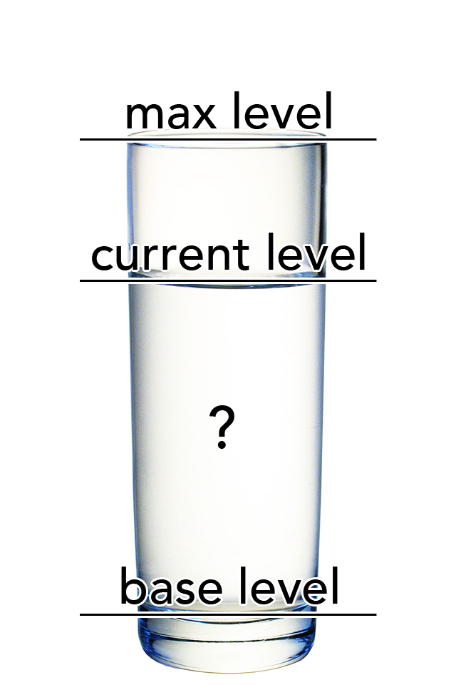
contens_appThe Contents App is an utility application that allows you to quickly estimate the content in a glass.

All you have to do is line up the “base level” with the bottom of the glass.
Set the “max level” to the top of the glass.
Set the “current level” to the current water level.
Double tap the screen and you’ll see the estimate content value of the glass.
Simple and easy

*extra feature: press the i button at the upper right side of the screen. This allow you to switch from a percentage estimate to a 250 ml, 500 ml or a 1 liter content value.

View in App Store 

Note:

A new way of using overlay views and if you think about it: simple and so useful depending on the situation of course.


EMDR 101

EMDR_Promo EMDR 101 is your companion into the world of EMDR as a treatment method for various mental disorders.

Whether you’re new to EMDR or a seasoned practitioner, EMDR 101 will still be useful in one way or the other.

EMDR 101 gives you a clear overview of the various phases of an EMDR session (description and goal).

With the “Guided EMDR Session” option you can do an EMDR Session in any place that you want and work through the difficult issues that you struggling with. And whenever you feel overwhelmed with feelings & emotions, you can stop by simply closing the app. And resume when you are ready. You’re always in control.
So find a comfortable and safe place that you know…and start the session.

The “Custom EMDR Session” is for when you know more about EMDR. And it allows you to go straight to the point of desensitization & installation.

The “Dot Only Display” mode is a go-to option for an EMDR therapist. A distraction-free and easy to handle tool that you can use in your sessions.


download on the app store

Iron Man 3 – the official game (Casanova armor)

20131231-111418.jpg

So I’m having an Iron Man 3 game addiction currently apparently. I’ve been playing a lot since the new update. Really wanted to see and try out the new anti missile special. Although the new Nightclub and Disco armor do seem weak. Low multiplier, health, weapon power etc.
Collecting the pieces is very long and troublesome. Pieces don’t spawn that much and only in the dessert and space location.
So really glad that another one was available last week. The Casanova armor, unlocked it (got enough experience). But not enough Stark Credits (415k needed). So after a week of playing and collecting…
First impression: missile special seems ok. Guess need to upgrade to a longer duration. The one downside of the new weapon is that it takes forever to charge…which…makes it less useful then expected.
The other stupid thing is that the weapon skill can only be activated when there are planes or missiles present…which sometimes activates to late and you get hit…sigh…defeats it purpose if you ask me.
Going to upgrade it to the max and see how it does compared to the Piston armor. That is still the best one. 10 seconds invulnerability on a max out special. My choice and go to to avoid the difficult missile clusters.

*Update*
It took a while but finally managed to upgrade the Casanova armor to the max. You got to do 380 times a 10 hit combo for the special weapon, defeat 2400 AIM soldiers for regular weapon & avoid 9000 obstacles for health. But max out armor is sweet. 41 seconds worry free travel against missiles is fine 🙂

20140108-171024.jpg