TweetPaper App
![]() TweetPaper is finally live after month of hard work. What is
TweetPaper is finally live after month of hard work. What is
What is TweetPaper?
TweetPaper is a Twitter Client.
So? There are a lot of Twitter Clients in the AppStore.
Indeed, you are right.
What’s so special about it?
It depends on what you consider special. It can’t turn water into wine or iron into gold. But what it can do is display your Twitter feeds in a new way.
In a new way?
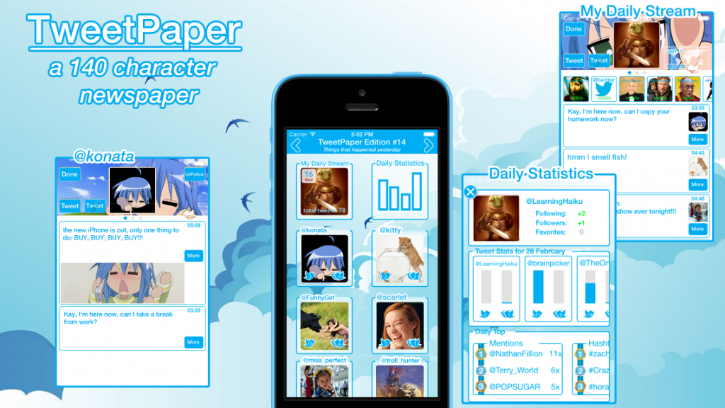
Yes, TweetPaper organizes your tweets into 3 separate view-frames (today, yesterday and days ago).
Ehm… view-frame?
Yeah, weird name. Open for suggestions. But the point is that a view-frame only contains tweets for the day of interest.
Day of interest?
“Today” is for the current tweets and “yesterday” for all the tweets from yesterday.
“Days ago” is a special one, which allows you to select a day and all the tweets of the selected day will be shown to you. It acts like an archive function.
Hmmm….what else can you tell me about view-frames?
A view-frame collects all the tweets of a day and analyzes the tweets specifics, like hashtags, mentions and retweets. All this info is gathered in the “Daily Statistics” frame that you can select.
Another frame?
Not quite, it more a part of the view-frame itself. Because each view-frame has one.
So it’s more a sub-frame or sub-view.
Yes, that’s the right programming term. But going back to the “Daily Statistics” frame, here you can find all kinds of tweet statistics. Like how many tweets or retweets was send by you or the persons that you follow. And when you click on them you’ll see a graphic display of that info.
“Daily Statistics” also contains a daily top section. Daily top lists the top 3 in tweets, retweets, mentions and hashtags.
Hah…now I understand the name statistics.
Yes, but an easy and understandable one, with…
What ever! What else?
Daily Statistics also tracks your following and followers count.
Ahh…you’ve got my interest. Tell me more.
The info is listed at the top. When you gain followers, you’ll see the gained amount in green. This also applies for following and favorites.
In green?
Yes, in green. Because it turns red when you lose a follower or stop following someone. It’s a color choice.
Furthermore when you click on it, you’ll get a graphic chart about the changes.
Hmm ok. Anything else beside statistics?
At the bottom when you follow someone new, they will be listed there, profile picture changes and other updates.
No I mean something else beside statistics!
There is another sub frame called “My Daily Stream”. Just like “Daily Statistics” you’ll find it in all three of the view-frames.
What does “My Daily Stream” do?
It list all the tweets from the all persons that you follow in a “mini day” timeline.
Hmm that’s not really special.
Indeed, you are right again. But it’s there because… I can’t really omit it without other users complaining about missing it… can I?
It’s an expected feature nowadays.
But there is a twist.
A twist?
Yes “My Daily Stream” acts as the main stream of that day and contains all the tweets of all the persons that you follow.
And as the main stream it can be divided into sub streams.
Sub streams?
Yeah, sub streams… for lack of a better word choice. Again open for suggestions. Each person that you follow will have a sub stream. This opens up a faster way in navigating through your twitter feeds and allows you to ignore certain other tweets. There is also a hide function, by tapping on a user in the main stream you can hide their tweets.
Furthermore you can switch between the sub streams by swiping left or right and the next following person’s tweets will be shown.
Hmmm ok. What else?
To focus on the tweet message itself, all other non essential tweet info like replies, retweets and favorites counts are hidden. You can see them by tapping on the tweet.
Furthermore the reply, retweet and favorite buttons are all listed inside one button. A design choice.
Links in tweets can also be accessed with the more button.
Hmm design choice you say.
Yeah, that’s the hype and keyword nowadays.
Designed for iOS 7.
Minimalistic Design.
Colorful.
Gesture based navigation.
And some other design oriented words.
So yes a design choice. But also it felt right when I coded it like that. Of course things can change. Again open for suggestions.
Anyways try it out and let me know what you think.
So that’s all then?
No there is still a lot more to tell, like you can navigate between the view-frames with a swipe-drag gesture and see the paper folding animation (hence the name TweetPaper and also the newspaper aspect of news for a day).
TweetPaper was designed with the mindset: checking Twitter once or twice a day is enough.
To handle timezone difference and with it the date selection. All tweet follows the Twitter GMT-0 time and date creation notation. But but you can select a specific time zone in the settings menu (view-frame days ago, top right side).
Then there is customization where you can select a background image. And the special thing about this is…. you have to see it to understand it.
As for privacy concerns, all I can say is that I don’t collect them. All your Twitter statistics stays in TweetPaper. And when you delete the app all the data is deleted as well. You Twitter account is accessed using Apple’s social framework. You can allow access to it in the general settings menu.


